Functions and Graphing
Functions
We’ve talked about a data-based way of looking at storage in Mathematica with lists, matrices, tables, etc. But one other form of “storage” we can consider is functions. Mathematica allows us to define functions in a very similar way to how we might write down a function in mathematics. If we want to define some function \(f(x)=x^2+\frac{11}{x}\), we can simply write:
f[x_] := x^2+11/x
There are some important differences here. The first is the underscore (_) character on the left-hand side that is absent on the right-hand side. That tells Mathematica that the x in the function definition is a dummy variable.
We can easily apply functions to other functions as well:
g[x_]:=x/11;
g[f[x]]
will print:
x^2/11+1/x
Practice Problem: Functions
To make sure you can create functions, try creating a function \(h(u,~v)=(v,~u^2)\), (so \(h\) takes two arguments then produces a 2D point - think back to Lists!). Afterward, separately set u=5;v=2. Then evaluate \(h(3,~2)\) and make sure you get \((2,~9)\).
We can base functions on other functions (built-in or user-created) too. There are many built-in functions which take functions as arguments, which we discuss throughout the book.
Example: Calculus
One particularly useful realm for user-created functions is taking their integrals and derivatives. We can take a derivative \(\frac{d}{dx}\) of a function \(f(x)\) by using:
D[f[x], x]
Where we have defined f[x_]:= .... e.g., f[x_]:=x^2 will have D[f[x], x]=2x. Of course, because these are functions of whatever variable we apply, we can use any variable name we want in the derivative: D[f[y], y] = 2y.
We can also take integrals (both definite and indefinite), using the same command in both cases. To take the indefinite integral, we’ll use:
Integrate[f[x], x]
That will, for example, given f[x_]:=x^2, have Integrate[f[x], x]=x^3/3. If we’d rather take the definite integral, we can use:
Integrate[f[x], {x, a, b}]
where a and b are the limits of integration: \(\int_a^bf(x)dx\).
Practice Problem: Calculus
For practice with calculus functions, try evaluating \(\frac{d\ln{x}}{dx},~\int\sin^2(x)dx\) in Mathematica and make sure you get \(\frac{1}{x},~\frac{x}{2}-\frac{\sin(2x)}{4}\).
Introduction to Graphing
Until this point, we have largely just dealt with numbers and functions. Now, let’s take a look at expressing data more graphically, and how to customize the display for different scenarios.
Basic 2D Graphs
First, let’s look at graphing functions in two-dimensions, with some basic customization features. The simplest is Plot[f[x], {x, a, b}], which will plot the function \(f(x)\) from \(x=a\) to \(x=b\), with \(x\) on the horizontal axis and \(f(x)\) on the vertical axis, selecting an automatic, appropriate range for \(f(x)\). For example, for \(f(x)=\sin(x),~x\in[0, 2\pi]\), we have Plot[Sin[x], {x, 0, 2 Pi}], which will produce:
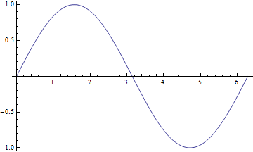
Simple plot for \(f(x)=\sin(x)\).
While we might be able to tell what’s going on in the graph above, that’s not always going to be the case. For example, we might want to have some basic labels on the graph, for the axes and for a title. Turns out, this is very easy to do with our friend from the Evaluating Symbolic Expressions section, the rule operator (->). Many functions allow for optional arguments using the name of the argument and the rule operator to the desired value. For example, with the Plot function above, we might want to label axes. We do that with the AxesLabel argument:
Plot[Sin[x], {x, 0, 2 Pi}, AxesLabel->{"x","f(x)"}]
which will create:
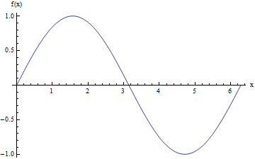
Plot for \(f(x)=\sin(x)\), with labeled axes.
We can further add a title to the graph (PlotLabel->"My Title"), define a different range for the plot (PlotRange -> {{xmin, xmax}, {ymin, ymax}}), select the color and style of the line (PlotStyle->[Green, Dashed, Thin] - some colors are pre-defined, but we can use RGBColor[red,green,blue] and RGBColor[red,green,blue,alpha] to create custom colors), and label the functions we’re graphing (PlotLegends->"Expressions" - a special option that prints the function definitions). We can actually plot more than one function at a time too by providing a list of functions as the first argument (all functions of the same variable). If we do that, then for the PlotStyle, we will find it helpful to provide instead a list of the styles. So, for example, we could have:
Plot[{Sin[x], Cos[x]},
 {x, 0, 2 Pi},
 AxesLabel -> {"x", "f(x)"} ,
 PlotLabel -> "My Title",
 PlotRange -> {{0, 3 Pi}, {-1.5, 1.5}},
 PlotStyle -> {
    {RGBColor[0.900082, 0.425655, 0.093112], Dashed, Thin},
    {RGBColor[0, 1, 0], DotDashed, Thick}},
 PlotLegends -> "Expressions"]
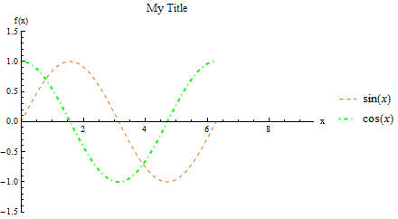
Plot for \(f(x)=\sin(x),~g(x)=\cos(x)\), with options specified above.
Additional things we can do include wrapping strings (PlotLabel or AxesLabel, etc.) in Style functions: PlotLabel->Style["title", Bold], which can update the text, rather than the lines/points on the graph. Furthermore, we can list several options: Style["text", Bold, Orange, Small, ...].
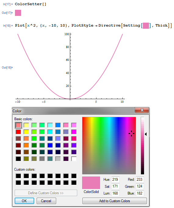
Interactive Color Choice
If we know what color we want, we can use a RGBColor to create it, but if we don’t know, we can create a ColorSetter to help us decide. ColorSetter[] creates a dialog box to select a specific color. That box can be copied into a place where a RGBColor is used to easily change colors of plots, etc. with a Setting command.
Practice Problem: Simple Plots
For practice, try creating the plot below. The functions are listed in the legend on the plot, but you might find use of the Thickness function (instead of just Thick or Thin) which takes a single value to determine the line thickness.
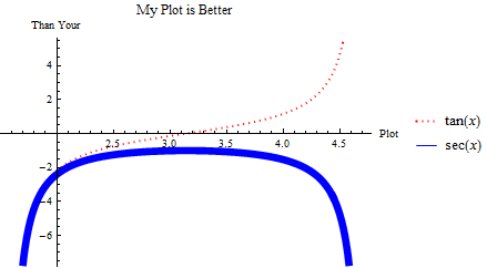
Plot to imitate.
There are several other useful plotting functions for other applications.
ListPlot is for plotting specific data in one of two formats. The first is a simple list of numbers \(\{a_1,~a_2,~...,~a_n\}\), assuming that it corresponds to points \(\{(1,~a_1),~(2,~a_2),~...,~(n,~a_n)\}\). The second (often more useful) is a set of points \(\{(a_1,~f(a_1)),~(a_2,~f(a_2)),~...,~(a_n,~f(a_n))\}\). As we saw in the section on Tables, we can easily create lists of points (which are just 2-element lists), with Table[{i, f[i]}, {i, imin, imax}]. So, for example, we can have:
ListPlot[Table[{i, Sin[i^2/1000]}, {i, 0, 200}]]
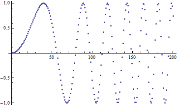
Plot of \(\sin\left(\frac{x^2}{1000}\right)\).
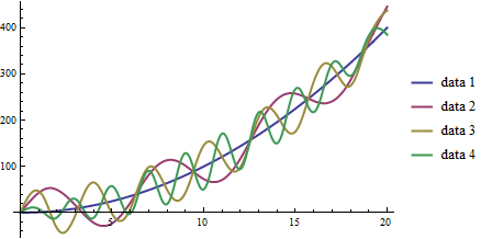
Like with the Plot function, we can have many lists of points as the first argument to the function. For a more interesting example:
(*Create four lists of points for 0<=a<=20*)
list = Table[Table[{a, a^2 + 50 Sin[c*a]}, {a, 0, 20}], {c, 0, 3}];
ListPlot[list,
        PlotLegends -> {"data 1", "data 2", "data 3", "data 4"},
        PlotStyle -> PointSize[Medium] (*Makes points bigger*)]
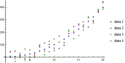
Plot of functions \(f_c(a)=a^2+50\sin(c*a)\) over \(a\in[0,20],~c\in[0,3]\).
With the ListLinePlot function, we get all the features of the ListPlot, but with consecutive points connected:
ListLinePlot[list,
    PlotLegends -> {"data 1", "data 2", "data 3", "data 4"}]
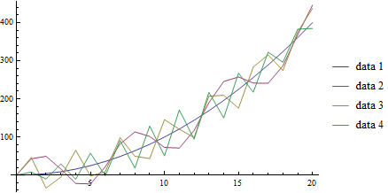
Plot of functions \(f_c(a)=a^2+50\sin(c*a)\) over \(a\in[0,20],~c\in[0,3]\).
As we will see in the section on Interpolation, we can interpolate our data, creating a fitting function. One other place we can use this feature of Mathematica is the ListLinePlot which will perform the interpolation and graph it all at once with the InterpolationOrder option. If this is greater than 0, Mathematica will apply a smoothing fit to the data of the degree specified between points (in practice, 3 usually gives a reasonable fit, and above 8 rarely makes visual difference):
ListLinePlot[list,
        PlotLegends -> {"data 1", "data 2", "data 3", "data 4"},
        PlotStyle -> Thick,
        InterpolationOrder -> 4]
Plot of functions \(f_c(a)=a^2+50\sin(c*a)\) over \(a\in[0,20],~c\in[0,3]\).
Other function plotters are applicable to other formulations. For example, we can have polar plots of the form \(r(\theta)=\cdots\) with the PolarPlot function:
PolarPlot[{Cos[3 t], -Cos[3 t]}, {t, 0, 10}, PlotStyle -> {Blue, Red}]
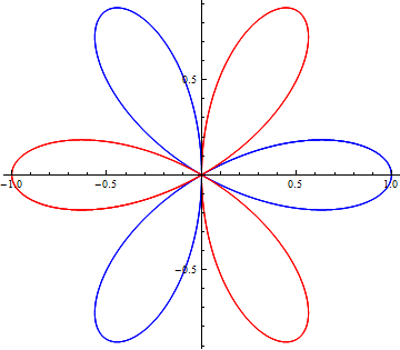
Plot of functions \(r_1(\theta)=\cos(3\theta),~r_2(\theta)=-\cos(3\theta),\) over \(\theta\in[0,10]\).
ParametricPlot accepts pairs of functions that together describe points. For example, we might have \(x(t)=\cos(t),~y(t)=\sin(t)\). We can plot that easily:
ParametricPlot[{Cos[t], Sin[t]}, {t, Pi/4, 7 Pi/4}]
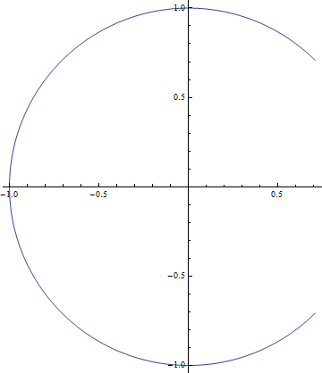
Plot of \(x(t)=\cos(t),~y(t)=\sin(t);~t\in[\pi/4,~7\pi/4]\).
We can have multiple pairs of functions, as with other plotting functions above, but one extra feature we have is to actually have two-parameter functions, plotting over both. Using a slightly modified example, \(x(t,~u)=u\cos(t),~y(t,~u)=u\sin(t)\), we can obtain plots like:
ParametricPlot[{u Cos[t], u Sin[t]}, {t, Pi/4, 7 Pi/4}, {u, 7, 10}]
Plot of \(x(t,~u)=u\cos(t),~y(t,~u)=u\sin(t);~t\in[\pi/4,~7\pi/4],~u\in[7,10]\).
We have the ContourPlot, which has a few variants, each based around the idea of finding level curves of functions of two variables. If you have ever used a topographical map while hiking, this will seem familiar. For an example, let’s start with a simple, not-so-interesting function \(f(x,~y)=(x-1)^2+(y+2)^2\). That has a vertex centered at \((1,~-2)\), but grows radially outward from there:
ContourPlot[(x - 1)^2 + (y + 2)^2, {x, -5, 5}, {y, -5, 5}]
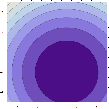
Plot of \(f(x,~y)=(x-1)^2+(y+2)^2;~x,y\in[-5,5]\).
In the default form, at least, this is largely uninteresting, just showing that the function grows bigger as it deviates from \((1,~-2)\). But, if we apply some more information, we can get customized information. In a moment, we’ll look at 3-dimensional graphs, which will help to visualize the actual function, but let’s now take \(f(x,~y)=|\sin(x)\sin(y)|\). We should expect peaks of this function wherever both \(\sin(x)\) and \(\sin(y)\) are at their extrema (\(-1,~1\)), since in all other cases, \(f\) will be less than \(1\). But we know that \(\forall{x,y}:f(x,~y)\in[0,~1]\) (that notation means “for all x and y, f is in that range”), so why don’t we see, for example, where \(f\) is some specific values:
f[x_, y_] := Abs[Sin[x] Sin[y]]
ContourPlot[
  {f[x, y] == .005,
  f[x, y] == .05,
  f[x, y] == .25,
  f[x, y] == .45,
  f[x, y] == .65,
  f[x, y] == .85,
  f[x, y] == .95},
 {x, -2 Pi, 2 Pi},
 {y, -2 Pi, 2 Pi},
 PlotLegends -> "Expressions"]
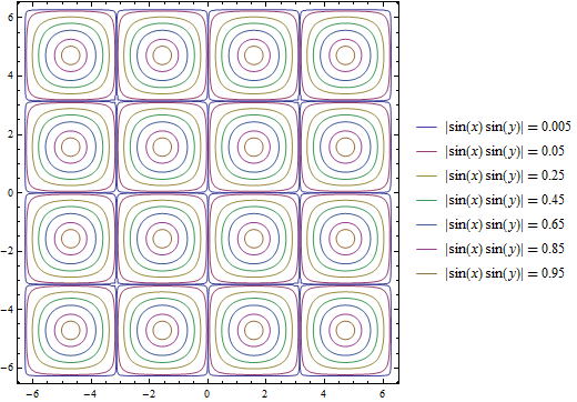
Plot of \(f(x,~y)=|\sin(x)\sin(y)|;~x,y\in[-2\pi,2\pi]\).
One other plot that is also interesting is the RegionPlot. This plot does not take a function, but rather a conditional expression. If true, the point is plotted. If not, the point is blank. For example:
RegionPlot[Or[Sqrt[x^2 + y^2] <= 10, x^2 > 144],
  {x, -15, 15}, {y, -15, 15}]
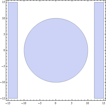
Plot of the region statisfying either \(x^2+y^2\leq{100}\) or \(|x|\geq{12}\).
See Also: Mathematical Logic
On some occasions, we may want to employ logic in addition to more familiar functions on real and complex numbers. While likely not needed for this course, it may help when dealing with complicated functions or with future programming projects in research, industry, and beyond. See the appendix for Mathematical Logic.
It should be noted that all of these graphing functions have other options available, which can always be found at the *Mathematica* Reference or using Mathematica’s help features.
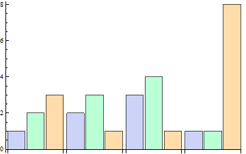
More Plots: Business Graphs
While less frequently used in science, “business graphs” (pie charts, simple bar graphs, etc.) are provided in Mathematica. For example:
BarChart[{{1, 2, 3}, {2, 3, 1}, {3, 4, 1}, {1, 1, 8}}]
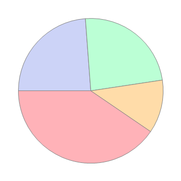
PieChart[{1, 1, .5, 1.7}]
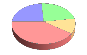
PieChart3D[{1, 1, .5, 1.7}]
For more, search in Mathematica‘s documentation for the “Charting And Information Visualization” guide (in Mathematica, can use “guide/ChartingAndInformationVisualization” in the search bar).
Basic 3D Graphs
We can do many of the things we did above in three-dimensional plots as well. The easiest example is Plot3D:
Plot3D[Sin[x y], {x, 0, 2 Pi}, {y, 0, 2 Pi}]
Plot of \(f(x,~y)=\sin(x\cdot y);~x,y\in[0,~2\pi]\)
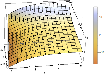
We have many of the same options as in the 3D case. We can label the whole plot with PlotLabel, label the independent variable axes with AxesLabel, and set the colors of graphs with PlotStyle. But, we have a few additional options. We can easily add a gradient to the plot (the default is shown above). The built-in ones can be created with ColorFunction->"name" where "name" is one of the elements seen below.
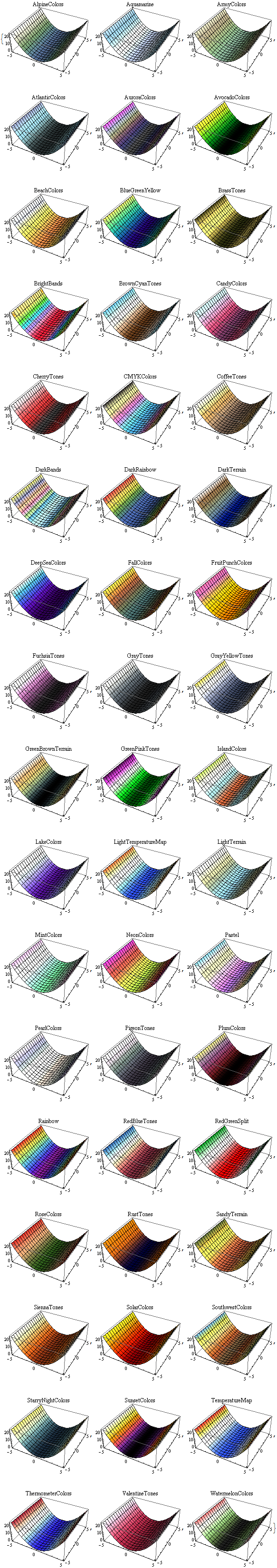
Colors available for ColorFunction.
In those cases, the function is a function of the plotted value only (not of the independent variables). However, we can create custom color functions by using the RGBColor function. We create a new Function in three variables (the three axes - the first then second independent axes then the value of the plot at that point, scaled for ) that involves some other color function, for example RGBColor:
Plot3D[Sin[x], {x, 0, 2 Pi}, {y, 0, 2 Pi},
  ColorFunction ->
  Function[{x, y, z},
    RGBColor[x, 0, 0]], (*Just produce red colors as a function of x*)
  AxesLabel -> Automatic]
Plot of \(f(x,~y)=\sin(x);~x,y\in[0,~2 Pi]\), with color as a function of \(x\).
We can make these as complicated as possible, but generally want to make color easy to work with if used as a gradient. The built-in functions have built-in plot legends as well:
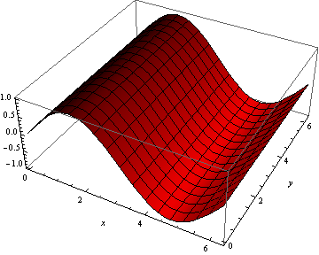
Plot3D[(x-2)^3 - .5(y-1)^3, {x, 0, 2 Pi}, {y, 0, 2 Pi},
  ColorFunction -> "BeachColors",
  AxesLabel -> Automatic,
  PlotLegends -> Automatic]
Plot of \(f(x,~y)=(x-2)^3-\frac{1}{2}(y-1)^3;~x,y\in[0,2\pi]\) with color legend.
We have a 3D-version of ListPlot as well, with ListPointPlot3D ( ListPlot3D gives a surface based on points on the surface rather than just points). For example:
ListPointPlot3D[Table[{i/10, Sin[i], Cos[i]}, {i, 0, 50, .05}],
  PlotStyle -> PointSize[Medium],
  BoxRatios -> Automatic (*Used to make the box scale better than default thin
  rectangular prism*)]
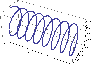
Plot of spiral \(\left(\frac{i}{10},~\sin(i),~\cos(i)\right);~i\in[0,50]\).
We have a 3D-version of RadialPlot with SphericalPlot3D, where we have a function \(r(\theta,~\phi)\) as the radius as a function of angles.
SphericalPlot3D[t p, {t, 0, 2 Pi}, {p, 0, Pi}]
Plot of \(r(\theta,~\phi)=\theta\phi;~\theta\in[0,~2\pi],~\phi\in[0,~\pi]\).
We have two versions of parametric plots in 3D. The first allows for three functions \(x(t),~y(t),~z(t)\), such as:
ParametricPlot3D[{{t, Sin[t], Cos[t]}}, {t, 0, 10},
  BoxRatios -> Automatic]
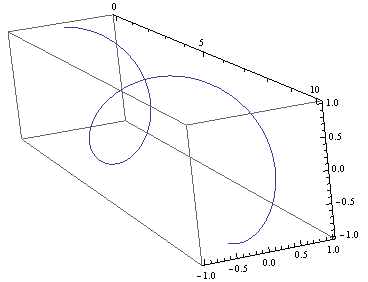
Plot of \(x(t)=t,~y(t)=\sin(t),~z(t)=\cos(t);~t\in[0,~10]\).
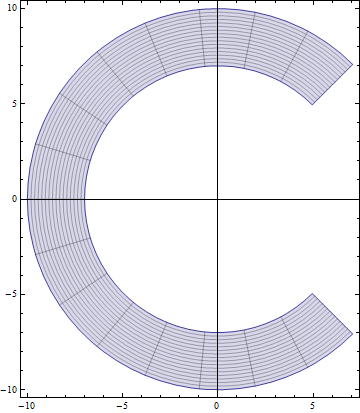
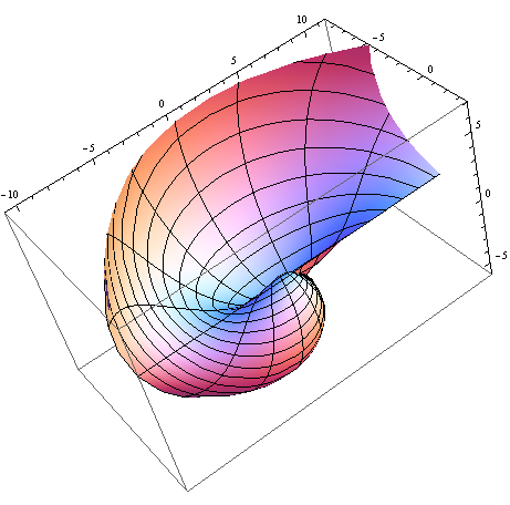
But we can also have functions of two variables \(x(u,~v),~y(u,~v),~z(u,~v)\):
ParametricPlot3D[{{v, u Sin[v], u Cos[v]}},
  {u, 8, 10},
  {v, 0, 8 Pi},
  BoxRatios -> Automatic,
  PlotStyle -> Blue]
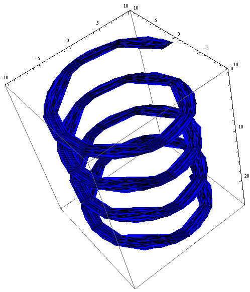
Plot of \(\left(v,~u\sin(v),~u\cos(v)\right);~u\in[8,10],~v\in[0,~8\pi]\).
We have a RegionPlot analogue in 3D as well with RegionPlot3D.
RegionPlot3D[
  And[x^2 + y^2 >= 36,
    x^2 + y^2 + z^2 <= 64],
  {x, -9, 9},
  {y, -9, 9},
  {z, -5, 5},
  ColorFunction -> "BrightBands"]
Plot of the intersection of regions \(x^2+y^2\geq36\) and \(x^2+y^2+z^2\leq64\).
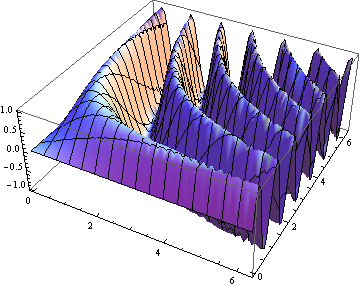
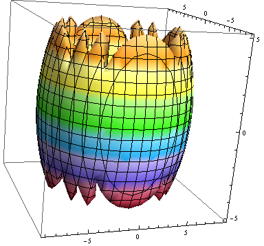
We have a plot unique to 3D plots based on the notion of rotating a 2D curve in 3D space. RevolutionPlot3D has several variants, the simplest of which takes a single function \(z(r);~r^2=x^2+y^2\):
Plot[Cos[r]^2/r, {r, 0, 8 Pi},
  PlotRange -> Automatic]
RevolutionPlot3D[ Cos[r]^2/r, {r, 0, 8 Pi},
  BoxRatios -> Automatic]
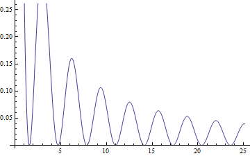
Plot of \(f(x)=\frac{\cos^2(x)}{x}\).
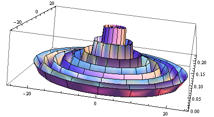
Plot of \(z(r)=\frac{\cos^2(r)}{r};~r^2=x^2+y^2\).
Practice with 3D Plots
Pick one of the code segments above and run it in Mathematica. Then, start playing. Change the function, click and drag the graph to view it from other angles, add labels, change the color scheme, add a legend. If you run into problems, use the Help feature on the graphing function (often, an option that works on one plot may need to be altered slightly to work on the other plot - use the “Details and Options” section of the documentation for each function to find out more).
For other variants of RevolutionPlot3D or any other plots, again, refer to Mathematica‘s documentation, or in Mathematica, use the “Basic Math Assistant” Pallete in the “Basic Commands” section for “2D” or “3D” then on the “More” option for “Visualizing Functions” or “Visualizing Data”. There, you will find many templates of these built-in graphing functions.
Basic “1D” Graphs
Sometimes (read: most of the time) we have sampled data for the same set of values for our independent variables and arrive at different “answers”. We’ll have more on why that occurs later, but it stems from both our inability to measure things in a laboratory with infinite precision (including our “control” variables!) and natural fluctuations in the world around us from thermal energy and other sources, which leads us to a distribution in our results. We often want to check that the observed distribution fits the distribution we expect (many times, for reasons we’ll discuss later, we’ll assume a Gaussian distribution). To do that, we can turn to a “1D” graph like a histogram which plots the relative frequency of results (put another way, how often of particular results occur) versus the result values [I say “1D” because we only provide a list of numbers, not points so the data is one-dimensional even though the plot is not]. In Mathematica, this is done with Histogram. Some examples:
Histogram[{
  1, 1, 1, 1, 1, 1,
  2, 2, 2, 2,
  3, 3, 3, 3, 3, 3, 3}]
Histogram[{
  1, 1, 1, 1, 1, 1,
  2, 2, 2, 2,
  3, 3, 3, 3, 3, 3, 3,
  5, 5, 5, 5, 5, 5, 5, 5, 5, 5, 5, 5, 5, 5, 5, 5, 5, 5, 5},
  {1} (* set size of "bin" to 1*)]
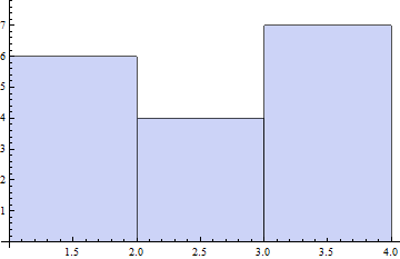
Plot of first dataset as a Histogram.
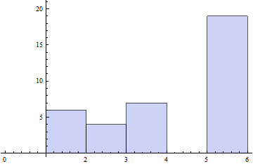
Plot of second dataset as a Histogram, with size of bin specified.
We can also have Mathematica smooth our data to provide an estimate of the shape of the distribution with SmoothHistogram.
We will explore more on Gaussian Distributions and histograms in the section on Gaussian Distributions.
Combining Plots
While we have seen how to combine similar plots (often just providing a list of functions to plot or two sets of data to the same plotting function), we might want to be smarter about our graphs, perhaps having an expected distribution plotted against real data. We can use the Show command to combine as many plots as we’d like. For example:
table={
  {0, 0.0491203},
  {1, 1.07251},
  {2, 2.09226},
  {3, 3.15284},
  {4, 4.13291},
  {5, 5.02879},
  {6, 6.08815},
  {7, 7.21867},
  {8, 8.00343},
  {9, 9.06134},
  {10, 10.0896}};
Show[
  Plot[x, {x, 0, 10}],
  ListPlot[table,
    PlotStyle -> {PointSize[Medium], Red}]
]
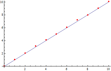
Plot of observed data and expected values using the Show function.
We can take things much farther too, by wrapping this in a Legended function, which allows us to easily label any type of data and have all those labels in a single spot. The following example is a little cumbersome, but is a good one for jumping in and trying things out for yourself. It’s more heavily commented for readability. This uses the more general Directive command, which allows you to make a line multiple things at once (thick, a color, dotted, etc.) in the most predictable way.
(*Fancy way of generating random data from a Normal Distribution*)
list = RandomVariate[NormalDistribution[0, 1], 50];

Legended[ (*Apply the graphic, then the legend*)
(*the graphic*)
Show[
        (*Plot data as a histogram of relative frequencies*)
    Histogram[list, Automatic, "PDF",
        ChartStyle -> RGBColor[.41, .65, 1]], (*set the color of bins to blue*)

        (*Plot smoothed data*)
        SmoothHistogram[list, Automatic,
                PlotStyle -> Directive[Thick, Green]], (*Set color to green AND make line thick*)

        (*Plot actual Normal distribution - don't worry about the specifics here.*)
        Plot[PDF[NormalDistribution[0, 1], x], {x, -8, 8},
                PlotStyle -> Directive[Thick, Red]]], (*Set color to red and make line thick*)

(*End of the graphic, now for the legend*)
Column[{ (*Create a new column to the right of what we just drew*)
        (*listing multiple items within a column will make them appear as rows within the column*)

        (*create a box symbol with the given color, and label it "data"*)
        SwatchLegend[{RGBColor[.41, .65, 1]}, {"data"}],

        (*create a line legend that's thick ang green with the given name*)
        LineLegend[{Directive[Thick, Green]}, {"smoothed data"}],

        (*Last legend element, end of Legended plot*)
        LineLegend[{Directive[Thick, Red]}, {"Normal Distribution"}]}]]
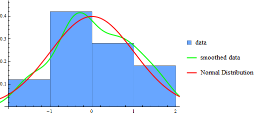
Plot of data drawn from a Normal distribution along with projected distribution from data and the actual distribution for reference, all in a Legended chart.
Practice Problem: Combining Graphs
Try adding other plots to the one above and then labeling them. For example, see if you can add in a plot for \(f(x)=x^2;~x\in[-2,20]\), but then re-scale the image to make sure you can clearly the existing graph information (hint: you can add a PlotRange in exactly one function and have it work - you might want to provide the range though, rather than using the Automatic version).
Vector Field Diagrams
We may have data that requires more dimensions to be displayed (for example, maybe we are tracking a particle’s velocity in 2D with respect to its 2D position). For this, we can turn to the VectorPlot function and its list-based and 3D cousins. First, an example:
VectorPlot[{y, -x}, {x, -5, 5}, {y, -5, 5}]
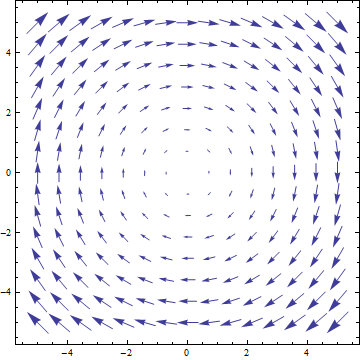
Vector-field plot for \(\frac{dx}{dt}=y,~\frac{dy}{dt}=-x\)
VectorPlot plots a vector at sampled points in the 2D domain as specified by the 2D function. The actual sizes of arrows are not necessarily useful, but their relative sizes are correct, giving a qualititave indication of strength of the velocity at the given points.
It has a handy feature of adding stream lines to the plot, doing a numerical approximation of the path that would be taken for a selection of points (user-specified or sampled):
VectorPlot[{10 Sin[y], -x^3}, {x, -5, 5}, {y, -5, 5},
        StreamPoints -> {{2, 3}, (*Plot paths that cross specific points*)
          {-3, .1},
          {0, 1}}]
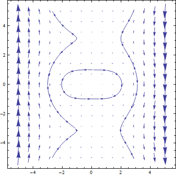
Vector-field plot for \(\frac{dx}{dt}=10\sin(y),~\frac{dy}{dt}=-x^3\).
We can use a StreamPlot to look just at stream lines, rather than the field, providing possible trajectories rather than just the vector field values:
StreamPlot[{10 Sin[y], -x^3}, {x, -5, 5}, {y, -5, 5}]
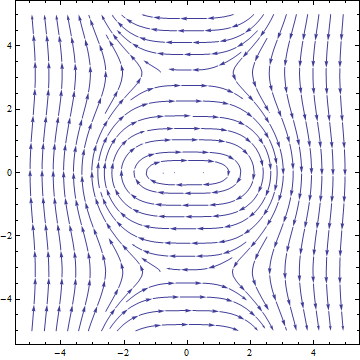
Stream-line plot for \(\frac{dx}{dt}=10\sin(y),~\frac{dy}{dt}=-x^3\).
We have a ListVectorPlot that takes a list of \(((x,~y),~(\frac{dx}{dt},~\frac{dy}{dt}))\) to produce a plot. The 3D version is ListVectorPlot3D which takes \(((x,~y,~z),~(\frac{dx}{dt},~\frac{dy}{dt},~\frac{dz}{dt}))\):
ListVectorPlot3D[
  Table[{{x, y, z}, {x Tan[y], -x^3  y, z}},
    {x, -5, 5},
    {y, -5, 5},
    {z, -5, 5}]]
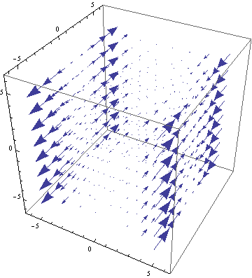
3D vector-field plot for \(\frac{dx}{dt}=x\tan(y),~\frac{dy}{dt}=-x^3,~\frac{dz}{dt}=z\).
Error Bars
We’ll talk about the importance of error in measurement later, but first we can see how to present error in our data. There are few built-in ways to do this in Mathematica, however, advanced users may find it useful to create their own functions to draw error bars on data. We’ll focus on the built-in ones. For this, we need the “ErrorBarPlots” package:
Needs["ErrorBarPlots`"]
We then get a single ListPlot variant called ErrorListPlot. It only accepts data in the form {{{x1,y1},ErrorBar[...]},{{x2,y2},ErrorBar[...]},...}, where the ErrorBar is:
ErrorBar[valv] (*valv is positive/negative error in vertical axis*)
ErrorBar[valh, valv] (*Each is pos/neg error, first horizontal then vertical*)
Where the values given are either real numbers or a 2-element list that gives {neg_error, pos_error} (to work properly, the first value should actually be negative and the second positive). For example, using the RandomReal function that generates random values over the range \([0,1)\):
ErrorListPlot[
        Table[{{i, Sqrt[i]},
                ErrorBar[{-RandomReal[]/5, RandomReal[]/5},
                        {-RandomReal[]/5, RandomReal[]/5}]},
                {i, 1, 16}],
        PlotStyle -> Directive[PointSize[0], Blue]]
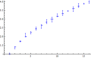
Example ErrorListPlot.
Practice Plotting Errors
To practice putting plots together, using many of the sections above (Combining Graphs, Error Bars, and other basic concepts), try to reproduce the following graphic:
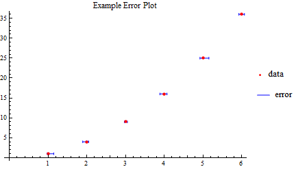
Plot to reproduce. The PointLegend function may prove useful. The function is just \(f(x)=x^2\), and the size of error bars is not critical, just labeling and creating the right dataset.